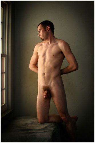
 Today’s portfolio choice is of Travis standing in the window, completely exposed. This is the natural spring morning light. My studio is designed in such a way that there is no direct light in to my shooting room, but I have built in a bank of windows to the east that are slightly shaded by the trees. During the spring before the leafs fill the trees I have a couple of weeks of the most beautiful light that fills the studio for about an hour or so each morning. I take full advantage of this sort of opportunity and call in everyone I can to explore the range of body, form and light with a different subject. When I first began photography all I had was natural light because I could not afford any kind of lighting equipment. I really learned to work with it and pay attention to the shift in color throughout the day. But having worked in theater for so many years I was always drawn to how I could control and refine the light; so using an artificial source allowed me to effect how I wanted it to look. But to me this was perfection to see the natural light and be able to work with it and still maintain my artistic vision.
I began printing the portfolio the past couple of days and have forgotten how complicated the printing process has become. I did most of the black and whites yesterday and they are much easier because you are only dealing with the curve of the tone and it’s easy to place them where you want, but color is a whole other matter. You are dealing with the curves of the tone now on many different levels because each one is affected by a different layer of color. I have all my equipment color calibrated to get close to what I see on the screen in the printing process. But a print is a completely different medium than the screen. It is viewed in two completely separate ways. One has to be translated to the other. With paper you are dealing with the reflectance of light off the surface of the medium, where as on the monitor you are looking through the light. I know this may sound silly, but it really takes a lot of tweaking to make the transfer possible. There is no specific setting that you can just set it to and it will automatically print; each print must be adjusted individually. I did not shoot all my images the same, therefore I cannot expect them to all print the same. So it really begins with a test print and then gets tweaked through a series of printings that eventually get me to the final point of satisfaction.

Printing in the darkroom was much the same, but seeming longer; upward of 20 minutes per print. I am using a very fine paper that runs about $1.50 sheet, and often times it take about 3 to 4 prints to get me in the range, so you can very quickly eat up a lot of expense on images that will merely get tossed away before I even get to the final artist proofs, much less the final prints. So the blog is late today because I am absorbed in this arduous task of creating final prints for the portfolio. I actually love this part of the process, as much as I become absorbed in it and forget to take breaks. When you are doing a large series, like I am for this portfolio, it really begins to break you down after a couple of hours and I really just need to step away and take a break. Now you all see my obsessive nature coming to light.
Today’s image is dedicated to my dear friend Greg Lane. He is a neighbor and has been a buddy for a very long time now. He used to come and help me on various photo shoots and has many of my images hanging around his house. Thanks for your constant support and your contribution to this project.
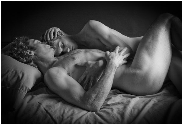 Every once in a while you create an image that utterly defines who you are. Today’s portfolio image is called “End of the Relationship #641.“ First of all this was the first time I had shot a couple together, both of the subjects I had been working with individually for several sessions. They had been together for a long time and knew that their relationship was coming to a close. They both needed to move in different directions and felt they had began to separate. The economy was crashing and it was becoming more and more difficult to find work and remain sustainable in Montana. One of them knew he had to get out of Montana and look for work elsewhere. They both trusted me and loved what I was doing photographically so they came to me to capture some images that would embody what their relationship had been before they separated. So I brought them into the studio, designed lighting that I thought would best enhance the mood of that relationship. It was probably one of the most entrancing photo shoots I have ever experienced. I had somehow felt like I had stepped inside their relationship and become a part of what was happening. We shot for several hours and with hundreds of photos, but this was the one that always lept out at me when I began to work through the series, and I am still drawn into it every time I look at it. To me this captured the essence of my identity as a gay man. This moment of connection to another man, embraced in each other’s arms.
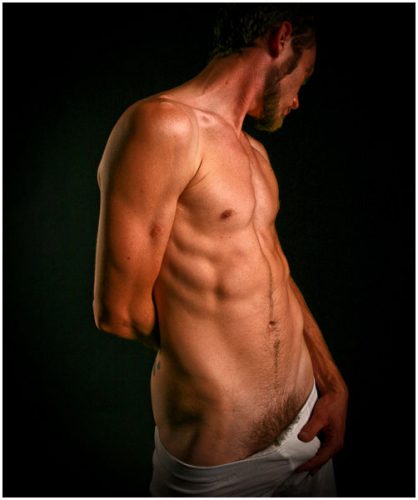
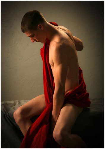 The third model I began to work with during the fall of 2009 was a man named Jeremy. Jeremy is the person I photographed the most; I could almost do a book on Jeremy alone. Every time I had an idea or concept of a new direction I wanted to explore, Jeremy was the guy I called. Today’s image was originally a study on the red cloth. I have always been fascinated by the use of light and beauty of balance in the paintings of Caravaggio. I had spent many days looking for various fabrics that would replicate the fabrics used in so many of his works. So I call this fabric a Caravaggio Red. It seemed to set off and balance with the natural skin tones. I had the walls of my studio finished with a heavy texture and then painted gray. I chose gray to control the light in the studio and to keep reflectance from bouncing around the room. But the gray also seems to have a hint of many different colors and the room actually changes color according to the light that fills the room at the moment. I tend to balance the color pallet of my light and exposure to a slightly warmer temperature, to affect a sort of candle or incandescent source. To me, it heightens the romantic context of the subject and mood of the subject. The warmer tones tend to bring out a greenish color of the gray in the walls, which I totally love. This image is my first real exploration into finding that balance of color, tone, and light. The images from this series were strictly meant to be a test and the images never intended to be shown. As Jeremy and I began to look at the images, we were both captivated so much that we pulled them from the trash and began to show them. The response was astonishing and the whole series become beautiful works of art.
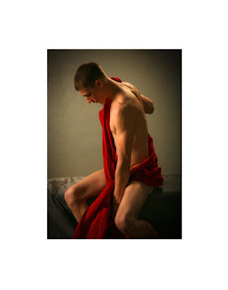
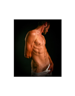
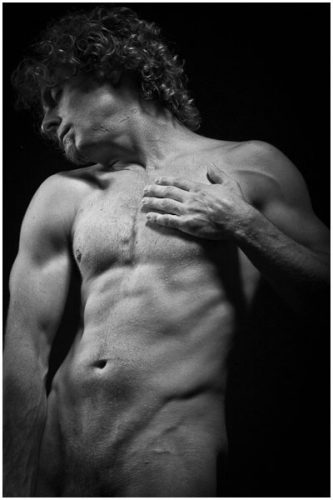 In the fall of 2009, I also began working with a guy named John and this image of him becomes the ninth image in the portfolio collection. John had a very classic body, but was completely unaware of what that meant. He was in his mid 30’s and had a lot of issues dealing with insecurities about how he saw himself. He was a painter by profession, I had met on line and began to chat with and eventually coaxed him into the studio for a session. We did several sessions and no matter how I lit him the classic beauty of his natural body shown through. He was probably the person most surprised to see him self in this light. The images work in color as well as black and white. I had recently been the Met in NYC and spent a day photographing the statues of their Greek and Roman collections, a passion of mine. But there the subjects were encased in marble and stood still indefinitely as I worked around them. With John this was the first time I actually worked with a live model to capture the essence of that classic style.
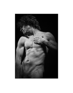
 During most of the fall of 2008 and into the summer of 2009, I redesigned the studio and it underwent construction. It was time to expand beyond the confines of my tiny painter’s studio.